How to plot grouped data in R using ggplot2
Understanding how outcomes vary based on membership to different groups is useful across many contexts. For instance, it is important to know how the proportion of people who check social media or buy cigarettes at least once a day varies across gender and socioeconomic status. Plots can really help people answer a question that pops up frequently: Are there differences in my variable of interest when I divide the data into different groups? In this post, I’ll be walking you through the steps I take to produce grouped plots in my own research using ggplot2 in R.
Before diving in, let’s first load the necessary packages:
# load packages -----------------------------------------------------------

## Package names
packages <- c("tidyverse", "datasets","papaja" ,"here")

## Install packages not yet installed
installed_packages <- packages %in% rownames(installed.packages())
if (any(installed_packages == FALSE)) {
	install.packages(packages[!installed_packages])
}

## Packages loading
invisible(lapply(packages, library, character.only = TRUE))
We’ll be using the freely accessible UBCadmissions dataset for this example, which is typically used to exemplify the risks of
Simpson’s paradox. Essentially, the dataset summarizes the number of graduate students that were admitted and rejected to the six largest graduate departments at UC Berkeley, broken down by department and gender.
Run this quick line of code to import the UBCadmissions data into your environment:
admissions <- as.data.frame(UCBAdmissions)
In the table below, we can see the general structure of the dataset. Note: for this example, I am including only three of the departments (“A”, “B”, and “C”). You can also write View(admissions) to look at the data, I just prefer using knitr::kable() because I find it more aesthetically pleasing, especially in reports 😄
admissions %>% filter(Dept %in% c("A", "B", "C")) %>% knitr::kable()
| Admit | Gender | Dept | Freq |
|---|---|---|---|
| Admitted | Male | A | 512 |
| Rejected | Male | A | 313 |
| Admitted | Female | A | 89 |
| Rejected | Female | A | 19 |
| Admitted | Male | B | 353 |
| Rejected | Male | B | 207 |
| Admitted | Female | B | 17 |
| Rejected | Female | B | 8 |
| Admitted | Male | C | 120 |
| Rejected | Male | C | 205 |
| Admitted | Female | C | 202 |
| Rejected | Female | C | 391 |
As you can see, the main variables are Admit (factor with 2 levels: “Admitted” and “Rejected”), Gender (factor with 2 levels: “Male” and “Female”), Dept (factor with 3 levels for this example: “A”, “B”, “C”), and Freq (numeric variable counting number of people that fall into each combination of the other three variables). This summary table can be used to compare the raw frequencies based on group membership. For instance, the first row suggests that there were a total of 512 men who were admitted to department “A” out of 825 who applied. However, in many cases, it’s much easier to visualize this data and make comparisons across groups with a plot than with a summary table.
Let’s say you’re a researcher who wants to present the admittance rates based on gender and department combined. To present this sort of information, I generally create a bar plot using the ggplot2 package. Here is the end goal for what our plot will look like:
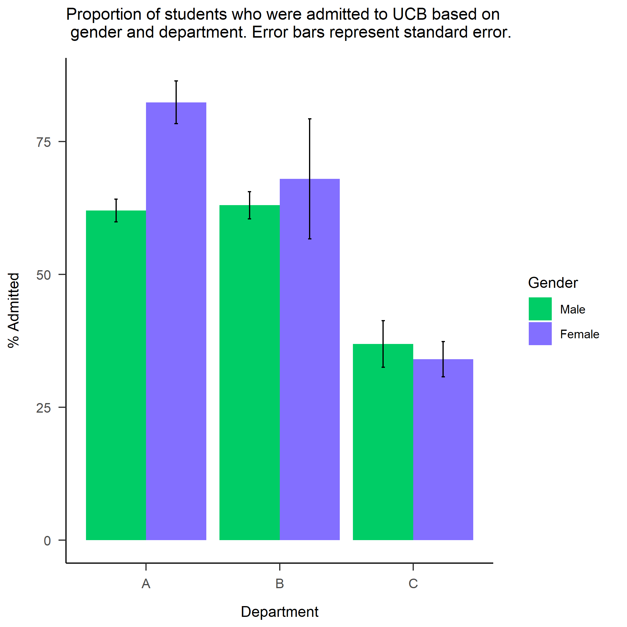
The plot suggests that there are differences in admittance rates across departments - department C is far less likely to admit students compared to departments A and B (note how the error bars are not even close to overlapping). At the same time, it appears that admittance rates based on gender differ substantially in department A, where women are admitted at much higher rates than men. Otherwise, there do not appear to be large differences in admittance rates based on gender.
It is worth noting that these percentages are calculated relative to each gender and department, rather than relative to the entire dataset. This allows us to directly compare the proportions of participants based on their representation within the dataset. You can imagine this is essential in datasets where there are large differences in the sizes of groups. For instance, if there are (theoretically) far more women (N = 5000) than men (N = 100) in the dataset, if you plot the data without calculating proportions relative to the total number of men/women, you are likely to infer that women have much higher admittance rates simply because they represent a much larger proportion of the data.
Now, I’ll break down the steps to create this plot.
Prepare the data for ggplot2
Before we start making the plot, we have to calculate the summary statistics that we want to be displayed. In our case, we will need to calculate the proportion of students that fall into each subset of categories that we are interested in: department (only A, B, and C) and gender. So we will start by selecting only the rows within the dataframe for Departments A, B, and C. Since our next goal is to calculate the proportion of men and women who were admitted within each of these departments, we need to group the students by their department and gender using group_by(). This function lets you perform operations based on group (for instance, proportion of students, based on their gender - the grouping variable - that were admitted across all departments). Then, I use mutate() to calculate my summary statistics for each group: 1) proportion of students admitted 2)
standard error of this percentage. Finally, since I’m only really interested in looking at proportions of students who were admitted, I am removing the rows that represent the proportion of students who were rejected. We then store the new grouped dataset with its summary stats in a new variable admissions_percent, which will be submitted to the data argument of ggplot() in the next step!
admissions_percent <- admissions %>%

	## selecting only the 3 departments we want to show in the plot

	filter(Dept %in% c("A", "B", "C")) %>%

	## grouping based on gender and department

	group_by(Gender, Dept) %>%

	## calculating percent of students who fall into
	## each category based on each combination of department and gender

	mutate(percent = Freq/(sum(Freq)),
	se = sqrt((percent * (1-percent))/Freq)) %>%

	## selecting only the admitted column

	filter(Admit == "Admitted")
Create the foundation of the plot
We will now set up all the basic necessities for this plot. First, we enter the name of our dataset into the data argument, along with the x-axis variable (in this case, department) and the variable that will be mapped to the fill argument (in this case, gender). The default colors when using fill are pink and turquoise (sorry if my color terminology here is off 😳), but in the next section, I’ll be changing these (this is a matter of personal preference). Then, you tell ggplot which type of plot you want (in this case, bar graph) using geom_bar(), and indicate that you want your y-axis variable to represent the proportions as percentages rather than decimals by multiplying the percent value by 100. Finally, I set the bar position to “dodge” because I prefer to have my bars plotted next to each other for easier comparison across groups. If you don’t include anything for this argument, the default is to vertically stack the bars (see
here for an example of stacked bar charts). Since we chose to use our own homemade y-values, we set stat = "identity" to make the heights of the bars represent values in the data, rather than the default, which is to count the number of rows in each group.
Next, we will set up the error bars using geom_errorbar() (see
here and
here for more information on the various ways you can create error bars). To do this, I set the ymax and ymin values for the error bars to the percentage +/- the standard error (respectively), which we calculated in the previous step for each group. As demonstrated below, there are also options to change the width of the error bars (width = .05) and how far apart you want them to be (position_dodge(.9)). Feel free to adjust these to your liking.
And then if we store all of this into a plot object p and enter p into the console, we get:
p <- ggplot(data = admissions_percent, aes(x= Dept,fill = Gender))+

	## defining plot type and y-axis variable

	geom_bar(aes(y = percent*100),
	position = "dodge", stat = "identity") +

	## adding error bars

	geom_errorbar(aes(ymin =(percent*100)-(se*100),
	ymax =(percent*100)+(se*100)),
	width=.05, position=position_dodge(.9))

p
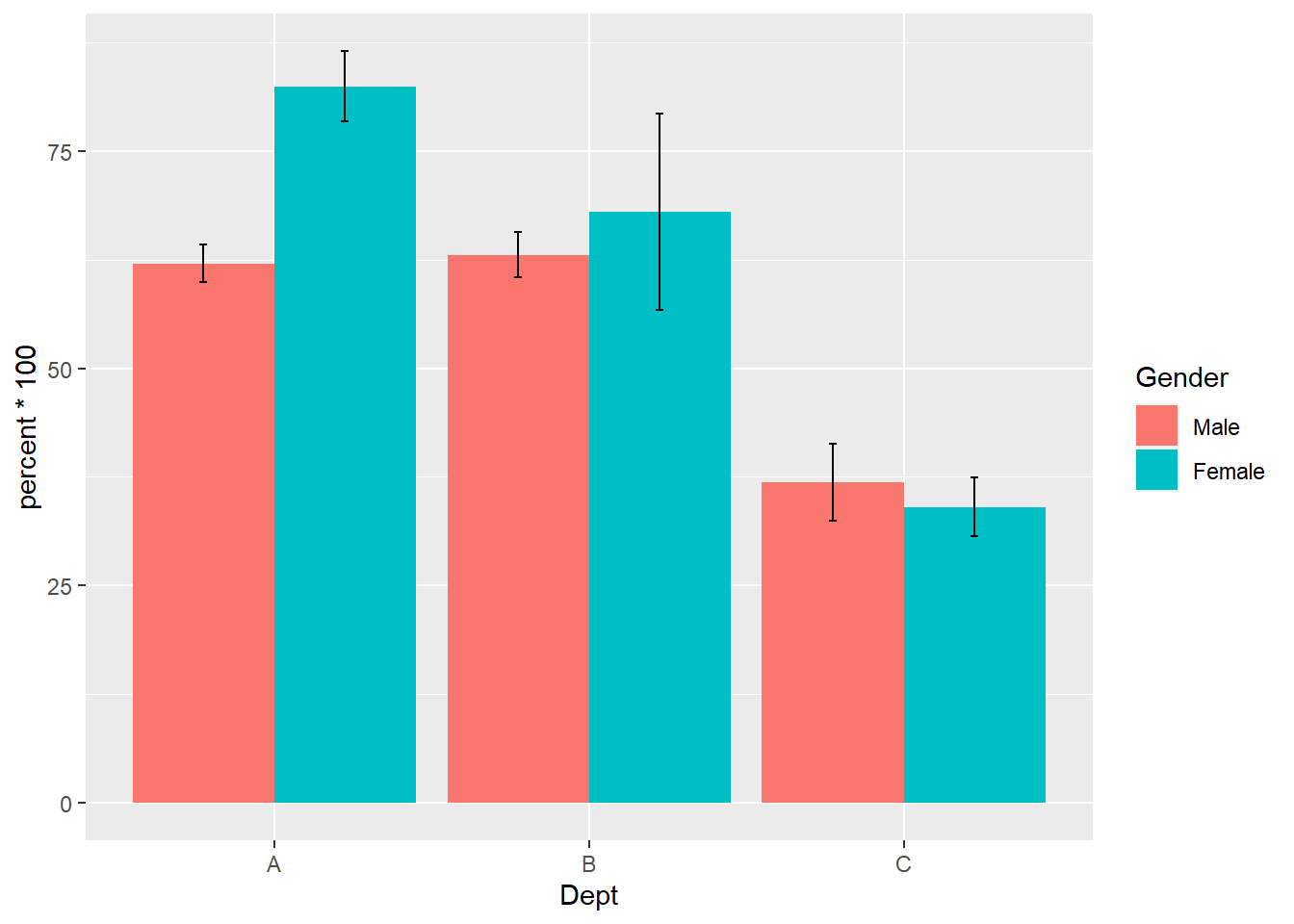
As you can see, we have the bare minimum here and there may be some default settings and labels/titles that you may want to remove or change, which I will show you how to do in the next step.
Add in the bells and whistles
I’m going to change the labels for the x-axis, y-axis, and title using labs() (note: I added "\n" below as part of the title to start a new line, otherwise the title gets cut off). The last step to change color and theme is purely optional. In the scale_fill_manual() function, I enter my desired colors (find a list of color names
here, general guidance on changing colors
here, or search a ton of pre-made color palettes
here and
here). Then, I add theme_apa() from the papaja package to align with APA figure standards, remove the panel border, and add in black axis lines.
p <- p + labs(x = 'Department', y = '% Admitted',
	title = "Proportion of students who were admitted to UCB based on \n gender and department. Error bars represent standard error.") +

## changing color and theme

	scale_fill_manual(values=c("springgreen3", "slateblue1")) +
  theme_apa() + theme(panel.border  = element_blank()) +
  theme(axis.line = element_line(color = 'black'))
Save the output
If you are writing a report in Rmarkdown and don’t need to save the image anywhere else or will never need to use it across documents (which seems unlikely), you’re all set. However, in many cases, you will need to save the image so you can use it elsewhere. Thus, your final step will usually involve saving the plot like I do below with the ggsave() function, which takes the following
arguments.
The first argument I use in ggsave() is path, where I entered the folders and subfolders I wanted to save the plot to (for example: the “figs” subfolder within the “study1” folder), followed by the name I want to assign to the file (“bar_admissions_gender_dept”) and the type of filed I wanted (".png"). To enter the file path, I highly recommend using here package, see more on why the here package is a good idea
here,
here, and
here 😏). Then, for the plot argument, I entered the name of the stored plot object (in this case, I saved my plot as p. FYI, the default is to use the last plot displayed). Finally, I added in some optional settings for the width and height of the output file. Note: this code to save the file, as is, will not work on your computer, unless your directory structure is exactly like mine.
ggsave(path = here("study1", "figs", "bar_admissions_gender_dept.png"),
	p, width = 7, height = 7)
And that’s it. Happy plotting!

Keana Richards
Doctoral researcher
Studying psychology and statistics at the University of Pennsylvania.